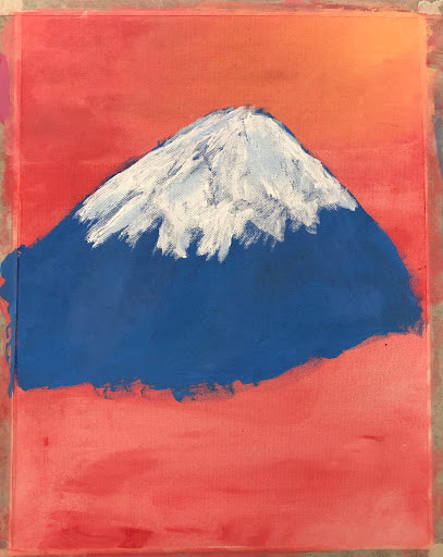
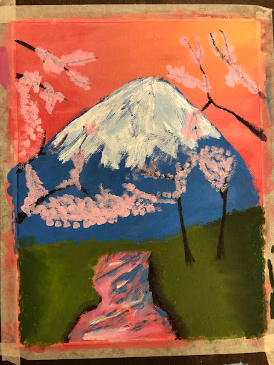
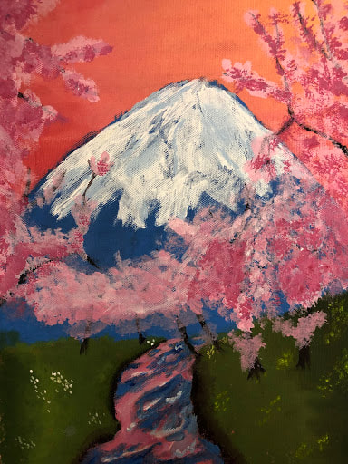
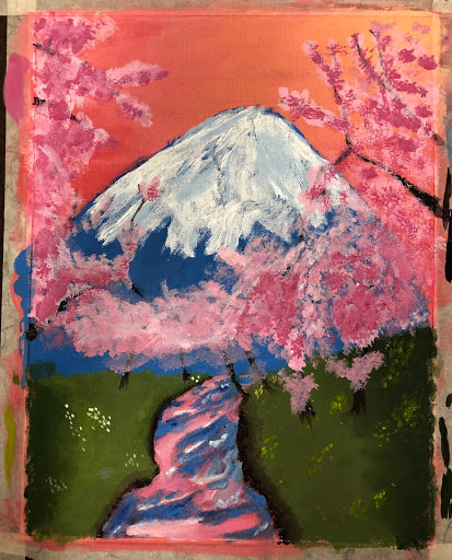
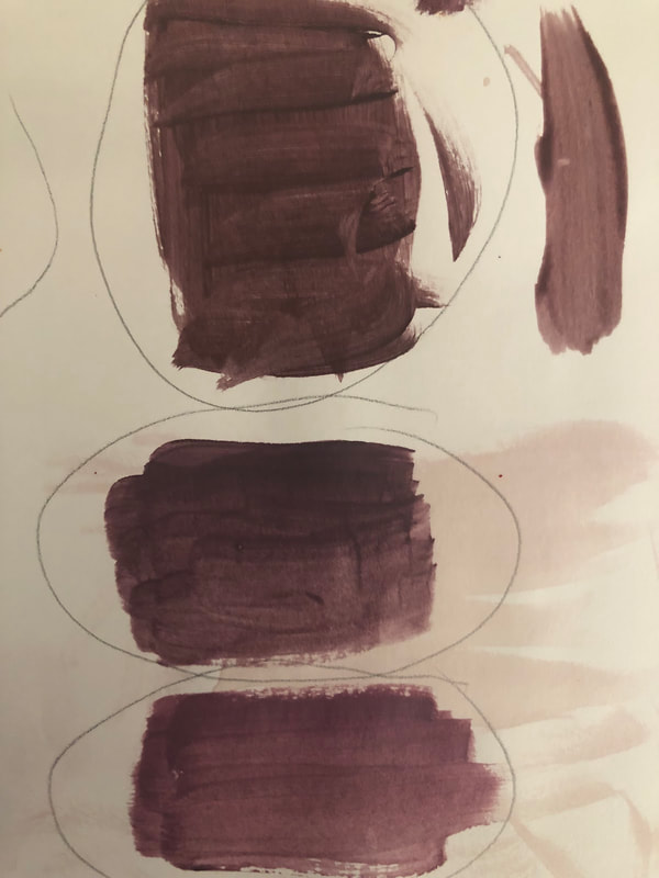
        The place that is represented in my art is the country Japan, a place close to my heart and is very important to me. The reason why Japan is so important to me is because, it's a country that I've always longed to visit. The moment I took the time to look into Japan's culture, scenery, memorials, tourist sites, history,etc., I was immediately interested and intrigued, which rarely happened, so I was shocked by how much I was interested in Japan. I was attracted to the beautiful language, verbally and by the physical characters. The language sounded so different from English, to me, it was a bit more graceful and it flowed nicer and sounded prettier and "cuter" in a way. The way they made their desserts reminded me of my childhood and it was so pretty and much different from American desserts. American desserts are always a bit to heavy and sweet but Japanese desserts were lighter and more appealing to the eye; the desserts that really caught my eye was the wagashi and the dango. The culture there was very graceful, and again reminded me of my similar roots and the sceneries and structures were beautiful and majestic. The temples were so peaceful and were filled with such rich history; there is very interesting tradition of putting up prayer blocks there called ema, which I find very loving and enchanting. I also want to go there is see all the unique plants and wildlife, especially the sakuras or cherry blossoms, shown in my painting, and to go see well known natural landscapes like Mt. Fuji, also in my painting. The traditional clothing of the Japaneses people, kimonos, are stunning and they possess such beautiful embroidery. I love the cute pop culture of manga, cute cartoon like characters, anime and video games, that are filled with colors and excitement, they just make you feel happier when your down. Japan is a very innovative, peaceful, safe, lovely and unique country, filled with a very different cultures and history from America. I'm in love with it, its very important to me and will always have a spot in my heart and I truly hope to see it one day and make wonderful memories. The most challenging part I think about painting my picture was the colors and the layers in the painting. It was hard blending, mixing and trying to create a similar color to the colors that were in my references to paint. Also, when I eventually got the color I wanted, that was at least similar to the color in my references, from all the mixing and the many attempts, I underestimate the amount I needed and ran out. Then, I had to re-blend or recreate the color by blending and mixing again, and I can never get the color to look like the color I blended before, no matter how many attempts I try to do, and it always looks to light or dark and its stands out against the color I used before on my painting. The layers were also difficult, it was hard to determine which layer, for example the mountain and the grass, to put first or later. The thing I feel that was most successful about my piece was the sky. It's not really the thing that attracts the most attention but its the thing in my piece that I'm the most happiest about. I spent a whole period on it and I loved how it turned out. The blend and transition from the yellow to the pink is really nice and smooth. But, also the yellow and the pink, even though they're blended together, both look unique and different in their own way, and provide different sides and value to the sky and provide different appealing bursts of colors to the sky. The sky really completes the piece, it's a detail that's overlooked but subtly really brings the whole piece together. It brings out the best in all of the other details and make all the different colors pop. All of the struggle to get the colors right and the difficulty of blending with both my finger and the brush were all worth it and I very happy with it and consider it a success. There were quite a few steps the the process of completing my painting. I, first, chose and printed references that either had most of the scene I had wanted in it or had a item or characteristic in it that I wanted to add to my painting. Next, I chose a sheet of canvas paper, taped it onto a board and began priming my canvas paper with a layer of diluted red and pink paint. While the red and pink paint were drying, using my references, I mixed colors to get the pink and yellow that I wanted to blend and use for my sky. I used both my finger and a brush to blend the two colors to create my sky and added more color where I thought there needed to be more of the pink or yellow. Second, I blended together colors to form a blue for my mountain and painted the general shape of the mountain that I wanted the mountain to look like. Then, I used white paint and a very, very light blue, that I mixed, to paint snow on top of the mountain and to kind of refine the top of the mountain. Next, I started on the grass, I mixed different tints and shades, and made two shades and two tints that I was satisfied with and wanted to use for my grass. Starting with my darkest shade, I dabbed it onto the edges on both the left and right, lower half, sides of my canvas, then dabbed on my lighter shade next to the darker shade, blending the two shades, doing this on both sides. Then, I dabbed my darker tint next to the lighter shade, blending it with the lighter shade and lastly dabbed on my lightest tint, blending it with my darker tint, all the while making sure to leave a river-like shaped space as I work towards the middle, from both sides. Afterwards, I mixed yellow and purple to form a brown and added a few branches and tree trunks. Then making the brown a little lighter with white, used the lighter brown to outline some of the edges of the river and dabbing some of the darker tint of green onto the part of the brown that meets the green grass to kinda blend the river edge into the green grass and to not make the "meet" or line between the green and the brown not too noticeable. Then, I mixed a pink with a considerable amount of red to make it darker and a light tint of pink. I also mixed a really light tint of blue and a darker tint of blue. Then, using the tint of pink and the darker pink and the two tints of blue and the two blue ,already provided, to me, straight out of the bottle, I tried creating a river with a reflection of cherry blossoms on its surface. I added different values to the water surfaces with my variety of blues, and majorly used the really light tint of blue with white paint to make rapids and used the pinks to make the reflection of the cherry blossoms on the river's surface. Then, I created the general shape of what I wanted my cherry blossoms to look like around my trunks and branches, with my really light pink tint, the same one I used in my river. Then, with the same brown I used for the other branches and trunks, I added more trunks, that were behind the trunks and branches I had put before. Then, with the darker pink, the one I used in the river, I added another layer to the lighter pink onto the cherry blossoms that were closer to the front, adding more value, color and shape, completing the cherry blossoms near the front. Then, just added a bit of really, really light pink, lighter then the light tint of pink used before, to the cherry blossoms more towards the back, adding value and shape to them. Afterwards, I made my river look like it was curving behind the grass on the right side and finished the outline for my river, blending the "meet" or line between the green and the brown and added a few touches the river and the reflection. Lastly, I added clusters of small dots of yellow on the grass to the right of the river and added clusters of white dots to the left of the river for clusters of small flowers on both sides. That was the process of me creating my art/painting.
0 Comments
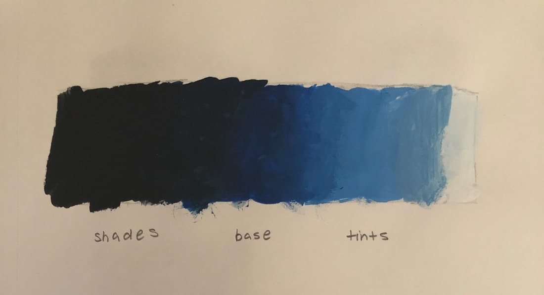
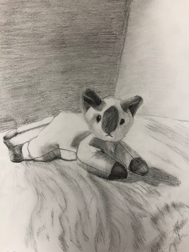
   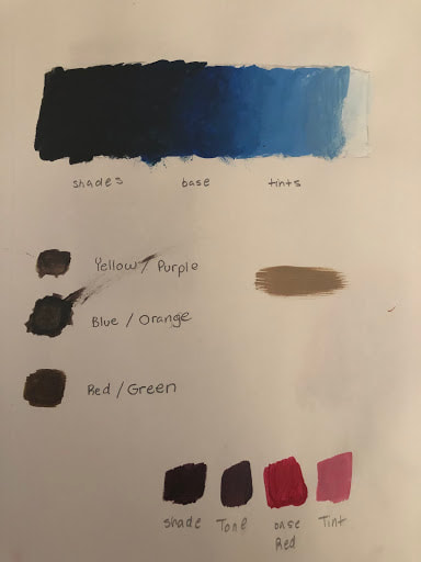   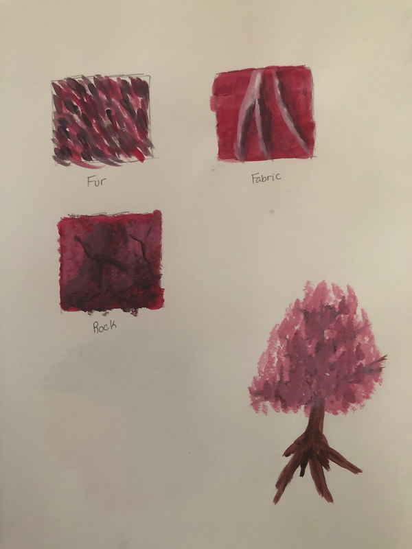 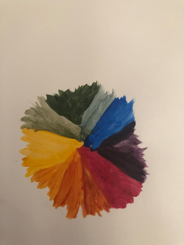 From these activities, I have learned a lot of skills on how to paint and use paint. I've learned how to mix paint and what colors to use to get the color I want. If I want to make a color light or make a tint of it, I add white, if a want it darker or a shade of the color, I add black and if want a tone, I add gray. I also learned about complementary colors, colors that are opposite of each other on the color wheel, colors that look best with each other. I've learned how to mix and blend paint to form a gradient, to make the the base color paint go from dark to light or light to dark smoothly, how to mix paint and know what colors to mostly use to form different skin tones and mix paint to create a color wheel. Lastly, I've learned how to create different textures with paint, including textures for rocks, fur and fabric and the fundamentals of how to draw a tree. For me, I feel that the activity we did on the second day of paint warm ups, where we learned how to paint a tree, will be the most helpful for painting I have planned. The painting I have mind involves cherry blossom trees as the centerpiece or the main characteristic, the thing that'll catch people's attention. By learning the fundamentals of how to draw a tree and its structure and what to keep in mind when drawing a tree, I now have a good idea on how to paint my trees. I didn't really have a good idea about how to draw the branches or the leaves of the tree but the activity gave me a better idea of how to do both ( in this case the blossoms, not the leaves) and now I have better chance of painting them and will hopefully be able to paint the cherry blossom trees I wanted to do, the ones on my reference. The activity I learned the most from was the activity where we learn how to do the three textures, the texture of rock, fur and fabric. Although the fur turned out decent, looking similar to the texture of fur, the other two, the rock and fabric texture did not look very similar to the textures they were suppose to look like. For the rock texture, the texture didn't look very hard and rough like a rock should be, the highlights were off and the crack in the rock didn't have dept and look like a crack. The fabric did even look close the fabric, the fabric has no flow and the highlights and shadings are off. Even though the textures weren't very successful, I learned a lot. I learned what brushes and tints, shade and tones to use and what to do with them to get the texture. These textures are pretty common in the everyday world, so they will be used and needed a lot in art. I have a general idea of how to do and create these textures and from doing them i hope to be able to improve in them and be able to apply them into my future creations. Some ways to make brown are by mixing yellow and purple together, blue and orange together and red and green together. You can tone down a color by adding gray or the complementary color to the color you want to tone down, to mute or neutralize the color.
   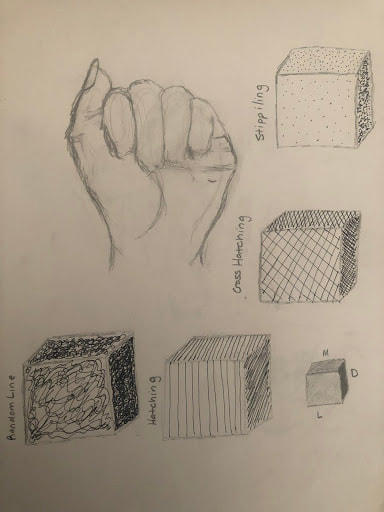 The warm up that was the most helpful for me was the pen cubes ( ignore the "A" in sign language in the picture above I did it on the same page with the pen cubes). The pen cubes warm up refreshed my memory on how to draw a proper cube, which I had forgotten and wanted to remember. The pen cubes warm up also taught how to correctly add value to a cube, learning about the lighting of the cube and the different shades for different sides of the cube. The front side of the cube is the lightest, the right side is the darkest and the top side is medium, a shade that is in between the lightest and the darkest. Not only that, the warm up introduced to me the different techniques you could use to shade and add value to a cube and create texture, using a pen, also we learned the techniques we could use and apply to our pen drawings. The techniques that were introduced to us were stippling, cross hatching, hatching, and random lines. I learned how to make some parts lighter and other parts darker for each technique, for example, for stippling, you add more dots to make a part darker and for hatching you add more lines to make a part darker. The definition for value is, an element of design that defines the light and darks in an artwork. The definition for composition is, the arrangement of elements within a work art. There are quite a few pros and cons for using pencil. Some pros are, if you make a mistake you are able to erase it and fix it, there are different pencils available, ranging in how dark and light they are, so its easier to create value, the point of a pencil is small, so it easier to add detail, they can be used to make a variety of textures quite easily, pencils also have a long life, they can be used on most surfaces and lastly they can blend well. Some cons are that pencils can smudge across the surface of what your drawing on and on your hand, they need to be sharpened regularly and if you press a bit to hard, they can create a dent in the paper, leaving traces if you try to erase the thing you drew that created the dent. The pen also has quite a few pros and cons. Some pros are that the small point stays consistent and makes it easier to do a lot of detail, especially small details, if the ink is dry, the pen won''t smudge across your surface or get on your hand, you don't have to sharpen it, there are many techniques you can do for value with a pen that's best with a pen then any other medium and since pen can't be erased, it can be good for eye-coordination exercises or other exercises and can teach people to think carefully about each move they make to draw. Some cons are that pen can't be erased, it's permanent, you can't fix a mistake you desperately want to fix or get rid of, if the ink is still wet, it will smudge, also by using pen it's hard to create value, since it stays a consistent shade, also pens can cause blotches and lastly, pens can dry up quickly and run out of ink. Finally, charcoal, which, like the other mediums, also has its many pros and cons. Some pros are, if the whole paper is smudged with charcoal, so that the whole paper is gray and you draw on it, you can easily get rid of of any mistakes by blending your mistakes into the paper, charcoals softens and blends beautifully, there is a variety of charcoal, so you can add value by using darker charcoal and by erasing charcoal to create lighter spots, you can add smaller details using a charcoal pencil, you can create a lot of textures using charcoal, especially sketchy, fluffy ones and lastly, it's very good for bold and heavy lines and soft and subtle shading. Some cons are, it smudges a lot on the surface and on your hand, which could ruin your art work and can be very messy, the darker charcoals are a little harder to blend out and blend into the paper, they work best on only a few surfaces and lastly they require a spray that smell strongly of chemicals to prevent from smearing the final product to much. |
CatherineAspiring to do something. Archives
May 2019
Categories |
 RSS Feed
