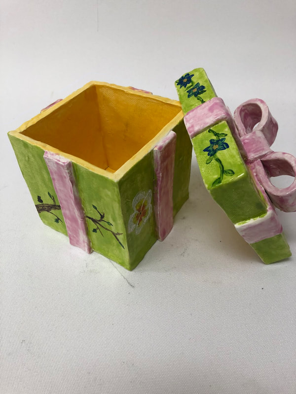
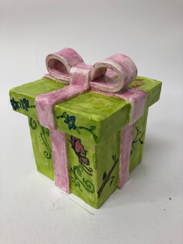
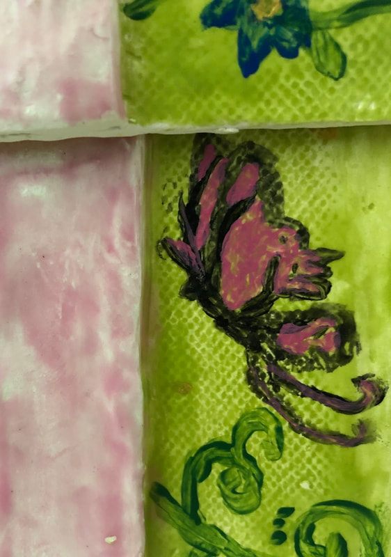
   For my finishing process, I had finish sculpting my gift box and had just finished the last step of smoothing out any stray marks I might have accidentally left and got my clay gift box fired in the kiln. After it was fired, I went and chose 3 different colors of glaze to glaze my box with, i eventually settled on making the outside of my box and its lid green, the ribbons on my box pink and the inside of my box would be yellow. I first used the green glaze and painted the glaze onto the outside of the box and lid, excluding the bottom of the box, the bottom of the edges of the lid and the ribbons, since the box and the lid will be fired separately and both need a place without glaze on them, so that they can be placed the kiln and won't stick to the kiln due to the glaze and also I'm glazing my ribbons a different color. Then, after glazing what I wanted green, I moved on to glazing the ribbons with pink glaze, making sure that I got every crevice, using various sized glazeware, especially in the areas around the bow on top, I was particularly careful around there and made sure to paint the the parts of the ribbon under the loops of the bow and inside the loops of the bow and I made sure to completely cover the edges/sides of the ribbons with glaze. The next step was me glazing the inside of the box and the inside of the lid with yellow glaze. Then I got it fired in the kiln again. Once my piece came out with the glaze, now very shiny and smooth from the glaze, I decided to paint some spring themed designs on my box with acrylic paint of various colors, on one side I did a bit of a swirl plant design with green paint and added a pink butterfly, on another side I painted a branch with the silhouette of a bird on it and the last side I painted on, I did a flower with that was yellow, orange and white. Then I painted the lid, on one side of the lid I painted a vine like design with blue flowers and on the top of the lid I did a small swirl design with gold paint and added red flowers to finish it off and then my piece was complete. There were quite a few things I found successful about my piece. The first is that the colors match and go with each other really well, and express the spring theme that I was going for in my piece; at first I was nervous, since the colors of the glazes that was just glazed/painted on my piece didn't really look nice together, but I was really happy with the results after the glaze was fired, the colors really matched and the glaze made my piece really shiny and smooth which I really liked. Something else that I thought was successful was the my piece is really proportionate, straight and realistic. At first with my idea of the lid, I thought it would look to big compared to the box itself, but it actually came out really proportionate, the lid was the right size for the box. The ribbons, especially the bow I did, made the piece very realistic like an actual present and the bow I shaped with dents in the side of loops and the the way i did the center of the bow, especially makes the piece realistic and the way I sculpted the lid and the ribbons I added on the sides also contribute to how realistic and similar it is to an actual gift box. Also, how straight I places the slabs without bents and making like an actual "square" from the top view of the box, without the lid and the lid itself looks very "square" form the tops and the straight sides look like how the straight sides of a gift box and it's lid should look. Also, the spring themed designs I painted on the the sides and the lid, they turned out to go really well with each other and contribute well to the spring theme and they look like what they are actually suppose to be, I particularly think the pink butterfly design was the most successful. If I had the option to do my piece again there are some things I would change. First, I would make the lid bigger and wider because when I first made the lid, I didn't consider the the ribbons I would put onto the sides when creating the lid, so the lid didn't fit over the added ribbons so I had to make indents into the inside of my lid so that the lid would fit. Another thing I would change is that I might've added a second layer of glaze or to be careful to paint the glaze more evenly on because I didn't like how the glaze wasn't consistent and there are uneven spots, some lighter and light to the point that it's practically white and some spots darker and the glaze is just uneven and splotchy all of the outside of the box and lid and the ribbon. Something else I would change is to be careful to not mix the glaze again on some parts where the pink glaze on the ribbons and bow meets the green glaze on the box and lid. When painting the edges on the ribbons I accidentally got some pink glaze on the green box where it suppose to be green and some green on the ribbons where it is suppose to be pink, and once it was fired, when the ribbons were suppose to be all pink, there were some small spots of green and on the box where the whole thing should be green, there were some small spots of pink, so next time I would be a bit more careful in those areas along the edges of the ribbons when applying glaze.
0 Comments
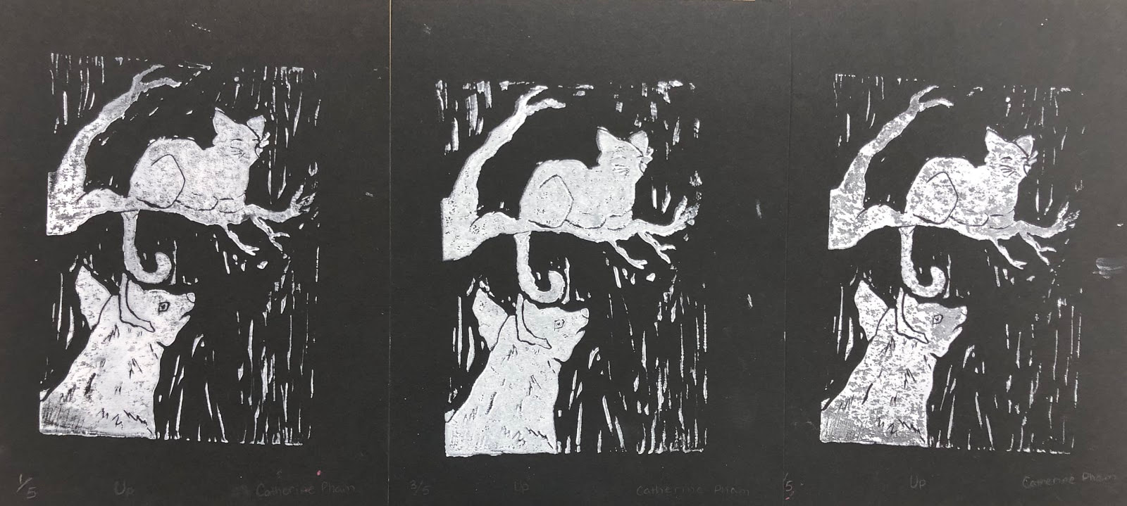 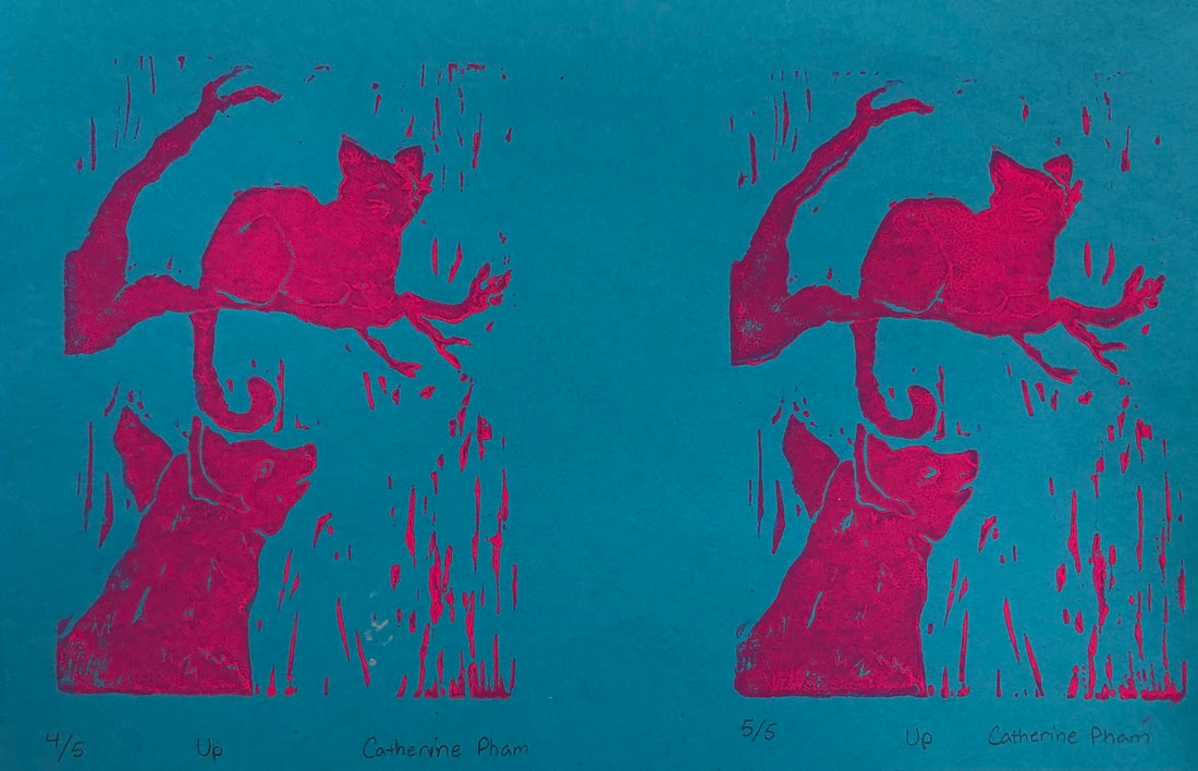 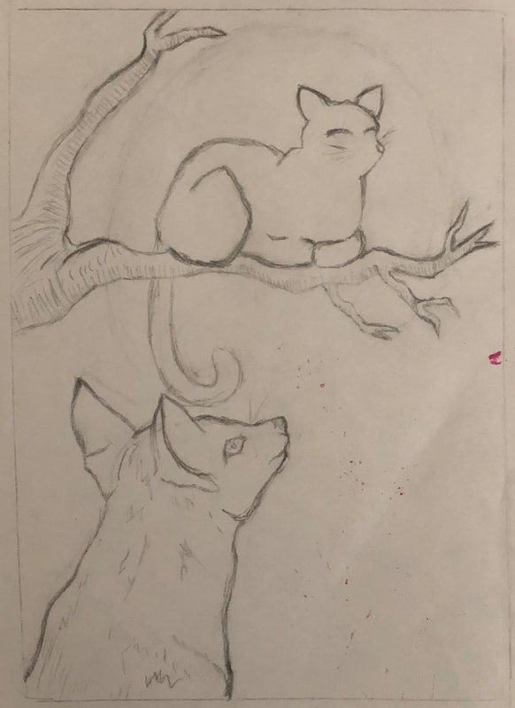 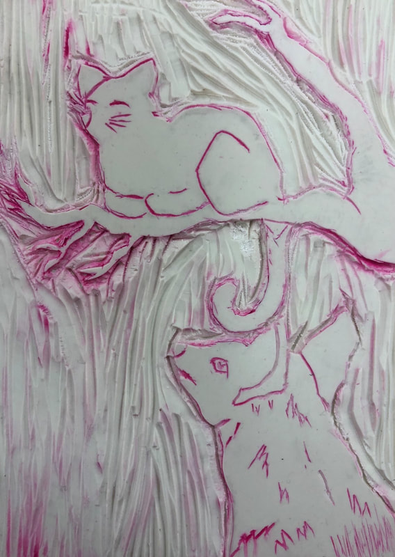 My piece really integrates, portrays and shows off the theme of "line very well. Lines are a really essential part in my piece, it makes the piece what it is and holds the whole piece together, all of the lines are slightly different, like in thickness and in direction and that adds character. Smaller and thinner lines lines make up the finer details in my piece, which really adds texture and depth into my painting and it really adds character into my cat and fox, like the fur on my fox and the eyes of the animals, both conveying very clear and different emotions. Lines really separate and define every individual main and bigger parts of my piece, like the my cat's legs and my branch. The lines my background of my piece of the background adds balance and detail, making my background more realistic and not so empty and plain The lines convey a sense and feeling of movement and energy in my piece, especially in my animals. The lines gives every part of my piece emotion, its own unique vibe, like the emotion of happiness in my cat and the solem, slightly angry and a bit curious face in my fox and the strength and elegance of my branch and its twigs. The lines are what draw people, most of the focus is on the lines and it creates the emotion, message and atmosphere of my piece. I think my piece was pretty successful, overall it really conveys that theme and has a lot of the details that I wanted in the piece. It has all the main parts, with the branch, the cat and the fox, the whole scene that I wanted to put into my piece. The thing I found the most successful was how the branch turned out with it's twigs, the twigs are very small, and the outline gives an effective nice rough, bumpy, flawed and dented texture on the branch and it bark and the shape of them also adds to how realistic they are and the shape of my cat turned out really whell to, out can tell its a cat and the tail hanging off the branch and the whiskers and nose turned out much better than I thought and they look really nice and I really like its expression of happiness. The background I also added also adds a bit more scenery and balance, it makes it looks like there are other trees or even rain in the background. Overall, really like how the piece turned out. There are some things I would like to change, my fox looks a bit like a dog and I would like to make it look more like a fox, by possibly making the snout longer or adding the whiskers I was going to put it and I also would like to add more detail to the eye, making it keener and sharper, also the line that was suppose to indicate and give shape to the top of its leg didn't come out very well and looks just like a line of fur so I would like to change it so that it looks more like the top of the fox's leg. The ink is also smudged for a few of my prints so I would like to use less ink or maybe be careful about the ink or carve deeper lines and I would also like my print to not be so crooked. The last thing i would like to change is maybe to add a little more detail to the branch, maybe curved lines for more texture on the bark or lines for value.
|
CatherineAspiring to do something. Archives
May 2019
Categories |
 RSS Feed
