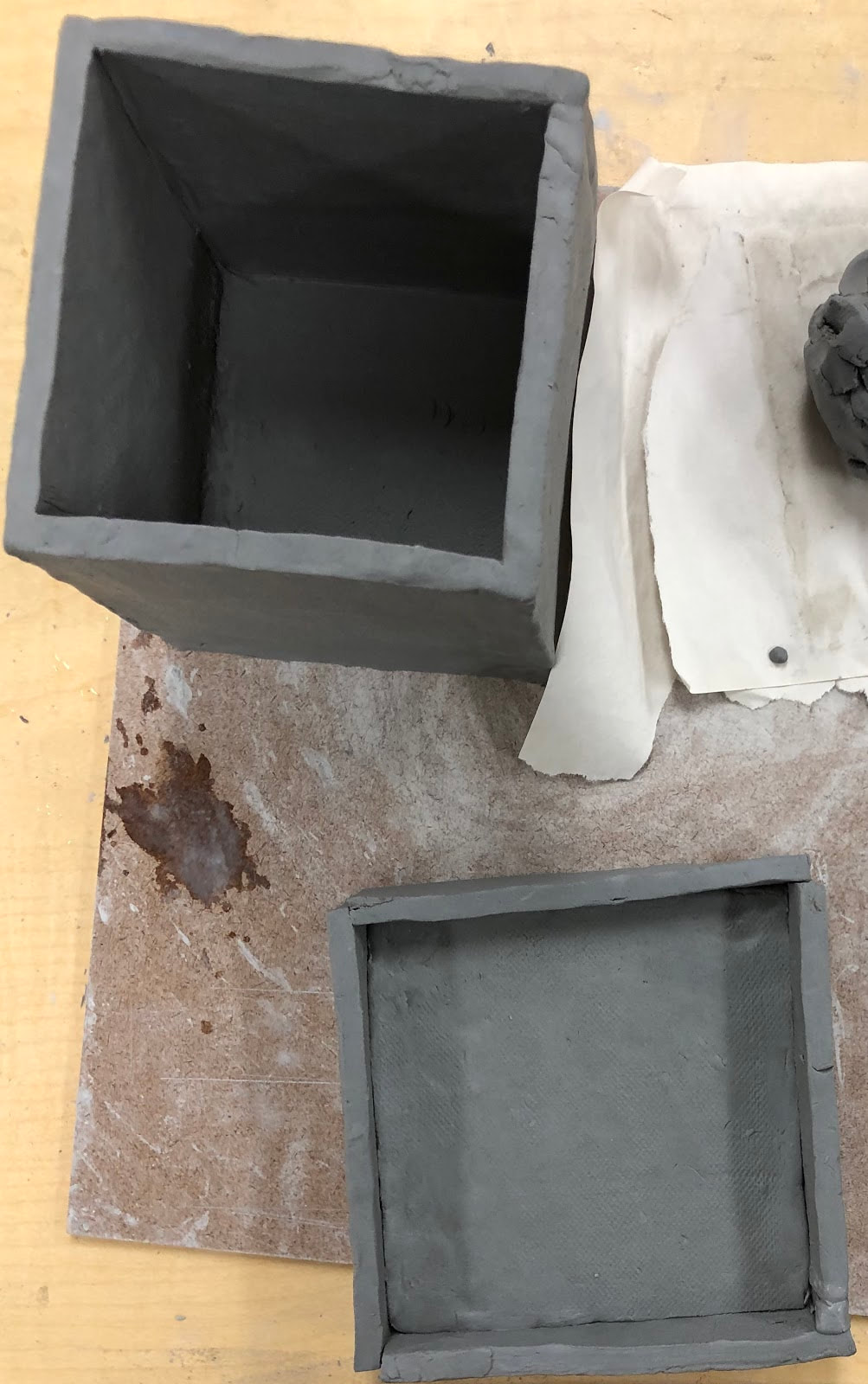
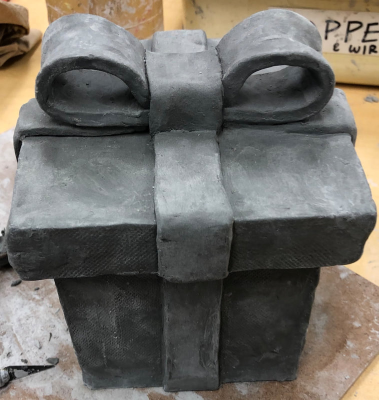
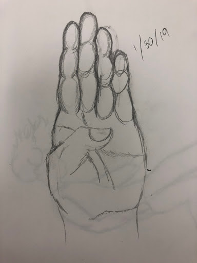
  My plan with this piece is the make it into a present or gift box, made out of clay. I want the lid to be just like a gift box lid would be like; I want the lid to "lock" and look like how a gift box's lid would a with the extra pieces on the the four sides that are attached to a square piece that is a little bigger than one side of the box, length and width wise, and the extra piece hang over the side of the box and allowing a snug fit and for the lid to "lock". I also want to add a knot/bow on top with four strands of ribbons made out of clay, going up and down vertically in the center, each on one of four sides of the box, the strands of ribbon on the side of the box and lid will be disconnected so you can actually lift the lid off, and all four clay strands of ribbon will meet or connect to a clay knot/bow in the center of the lid on top. To finish I plan to glaze the stands of ribbon and the know white or black and the actual box will be either blue or beige and after the glaze is fired, I plan to paint on some intricate designs of plants and patterns on the box. Something that I found that was difficult about clay is that it dries quite quickly and if it's just even a little dry, barely leather hard, it very hard to work with and it's hard to get it wet and to the right consistency that you are able to mold and use it properly again. If it's barely leather hard and you try mold it and work with it, it cracks and is't very moldable and if you try to wetting it with water, all it does is that the clay just becomes a muddy mess and if you try to roll out a ball of this barely leather hard clay, you end up with a long rolled out piece of clay with a bunch of cracks in it. Also, thin pieces of clay, like my ribbons o small pieces you want to add and didn't have the time to attach and have to leave overnight or over the weekend, are hard to keep moist and usually for me just dry out or are so dry to the point that they crumble and are no longer moldable. Also with clay, it's hard the repeatedly make similar things and stay consistent, like my ribbons, to keep them the same length and thickness and you had to constantly make adjustments. Another difficulty is that if a large chunk fell off or a barely or just leather hard small piece of detail fell off, it hard to reattach. Lastly, for me, it was also difficult because you were unintentionally making stray marks with your fingerprint, finger nail and other clay tools that you didn't want and it was tedious having to smooth out or filled these mark. Something that I found that was successful was that the slip and score method is very easy to do and very effective, it's easy to attach large pieces and small piece with each other by wetting and scoring or scraping, with a scraper or scoring rib, the sides of both the pieces you want to attach and none of the pieces are very moveable and haven't fallen off after using this method that created something that is similar to velcro so the pieces are attached strongly and firmly. Something else that I found that was successful was how versatile new and moist clay, it's very moldable and can be used to form a lot of different shapes for my clay piece, and i was able to create all the shapes that i wanted to make. It's also easy to cover any small mistakes or cracks you may have by just adding a bit of water and smoothing it out and/or adding just a little bit of clay. Something else that I found that was successful was that clay the is very easy to cut, a very smooth cut, and when the clay is about leather hard or a little bit dryer, it's easy to carve in things like designs, to things more smooth or to get rid of unwanted bits or, like me, to create some dents or slots for a piece to fit in, in my case I carved a bit of my lid so that it was abe to fit over the strands of ribbons on the four sides of the box. My piece is also successful because it turning out the way I want it to look, it looks just like a norml present would and the cap fits perfectly with a bit of adjustments to the lid and carving slots in the cap to fit of the ribbons. The ribbons and bow on top turned out the way I want them to, the ribbons look like they all connect to the one bow on top of my lid and I'm very fond of my bow, it's very similar to what a normal bow would look like and very relisti and the structure and shape of the clay piece is realistic and is mostly just like a common gift box. I first rolled out a ball of moist clay into a long piece of flat clay that was about 1/4 of an inch thick and cutted out four square soft slabs that were 4 inches by 4 inches and cutted out two more slabs that were 4 and 1/2 inches by 4 and 1/2 inches, then I separated each slab with paper and stored them. The next day I attached the four square, now hard slabs that were 4 inches by 4 inches in a rotation like form to form the four sides of my box and used attached them using the slip and score method using water and the scraper and wetting and scraping the areas of the two sides of the piece I wanted to attach to each other. Then, I put the four connected slabs, that are the sides for my box, on top of one of my 4 and 1/2 inches by 4 and 1/2 inches slab and cutted any access of clay of off that were along the edges of the four connected sides of my box and connected the remaining slab to form the bottom using the slip and core method and made some adjustments to make the bottom fit and to make it a flat bottom and to get and slivers of access I might've missed and to smooth out the crack from where the four sides meet the bottom piece so the bottom piece looks like it's connected and it's better attached and to make the piece just look more like a box. Then I smoothed out and cracks, including smoothing out the cracks from where the four sides meet the bottom but not from the out sides like last time but from the inside of the box so that it could be better attached, and any unintional marks I might've made. Then while the the other 4 and 1/2 inches by 4 and 1/2 inches slab is still in the greenware stage, I cutted out 4 pieces that were about 4 and 1/2 inches by 1 inch, and attached these pieces to each of the four sides of slab. Then I made some adjustments to 4 pieces, cutting them and attaching small pieces of clay to where they need to be and smooth out the cracks where the piece meet on the sides and the cracks where the pieces are attached to the slab, so that the lid actually looks like the lid of a gift box. Then I cutted out another four pieces that were 4 and 1/2 inches by 1 and these in half dept wise to make them thinner and attached these to the center of the four sides of my box for the strands of ribbons and made any adjustments that were needed. Then I cutted out another three pieces that were 4 and 1/2 inches by 1 and folded thes together and shaped them a bit to make a bow. I attached the bow to the center of the lid then cutted out four pieces that were 3 inches by 1 inch, cut those dept wise, and attached them to the four sides of of the lid, folding them over the top of the lid and the extra pieces attached on the sides and the pieces connect to the bow in the center of the lid. Then I realized that the cap I made wouldn't fit since I added the ribbons to the sides of my box so I carved dents/slots in my lid so that the ribbons fit into the slots and the lid can fit the box. I made the slots as neat and unnoticeable as possible and made sure the lid could nwo fit the box. Then the last step in my process that I've done so far is smooth out any bumps I didn't want and any stray or unintentional marks with water and moist clay. 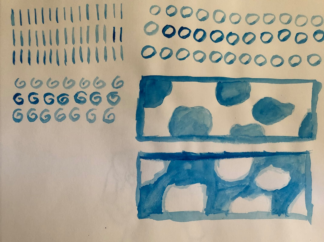 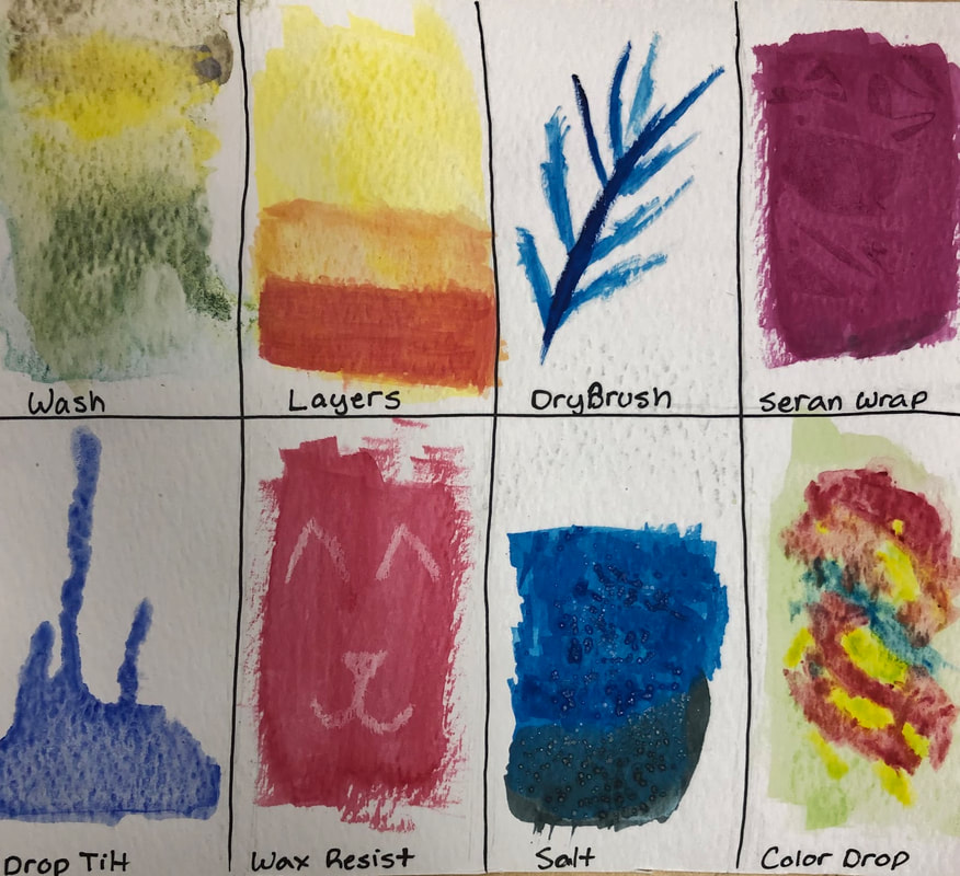 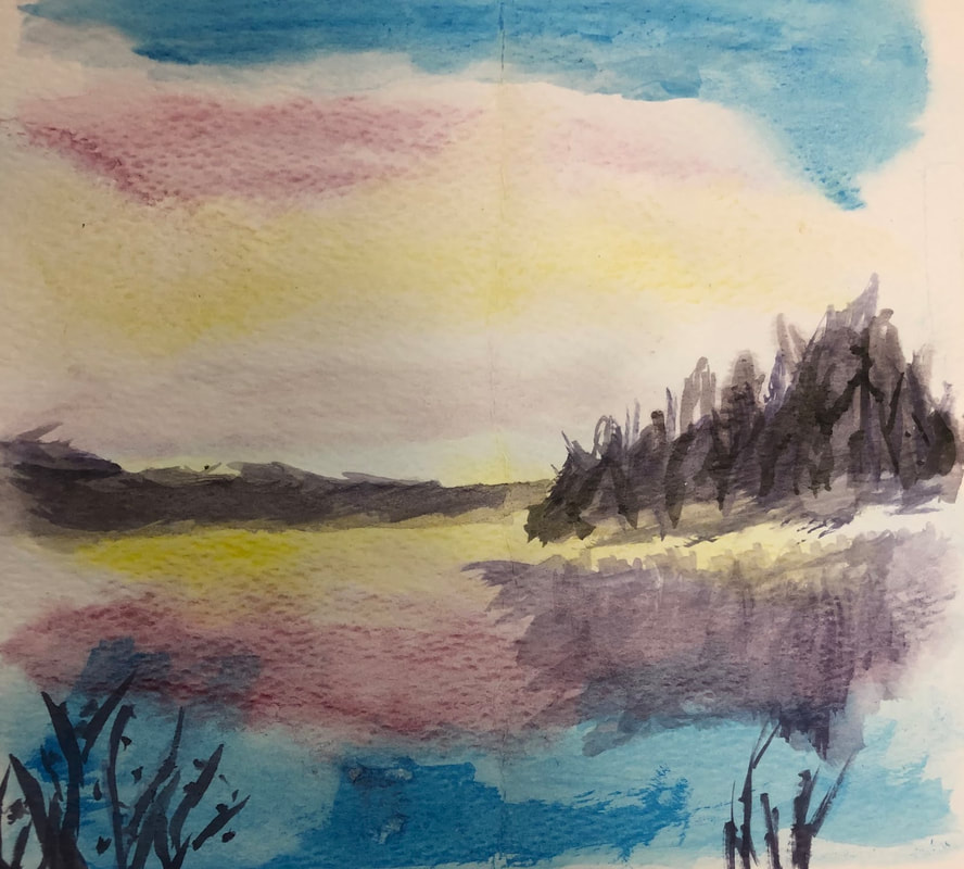 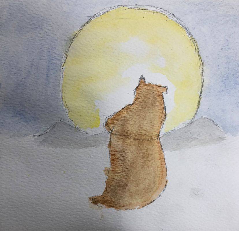 I find the water color techniques page activity we did the most helpful and interesting int he learning process. It introduced to me all the ways I could use water color in my painting, like how I can use certain techniques to make a certain thing seem more realistic and textured and also the techniques showed all the ways I could add details. both big and small, in my painting. It showed me so many different techniques I didn't even know existed until now like the wax resit and the salt techniques which i find most interesting and beautiful. It was my first warm up and I think it did a really good job of introducing me to water color, it showed me that you can use water color as both dry and wet, unlike what I initially thought which was that you could only use it wet, and it gave an idea about water colors features and characteristics and its pros and cons. I like how water color can be "reused", that once it's dried, all you need is to add water and you have wet paint again. I also like how you only need a little from the tube of paint and all you need to add water and you have a very large amount of that color. Also I find it pretty easy to make it lighter because all you need to do is add water and the more water you add the lighter it will be. I also really like the end result looked, it looked strangely textures, unique and smooth yet blotchy in a way and i really though it was pretty when it dried. The thing that I don't like about water color is that if the color is lighter or more deluded than another color, you can't paint it over another color because the darker color will show through, so you can't really paint over a mistake you did with dark a dark color unless you use a darker color and that's hard to do when you make mistake with really dark colors like black a purple. I also think it's difficult because it looks kind of different from how it initially looks on the tray from when you actually put it on your painting so you kind of have to try the color out on something first. Also the color is very inconsistent since it can look diff rent from when you spread it out more and from when you kind of clump it together and the colors are difficult to blend and its difficult to blend and get the colors you want. Also, it drys a little to fast or it dries to slow, since you can add to little or to much water to the paint. Lastly, it's difficult to control, it can seep or flow into areas you don't want it to and since those areas are usually wet, you have to wait until the areas are dry, which can take a long time, before you can work next to the area to prevent the color from seeping into the area you don't want it to. 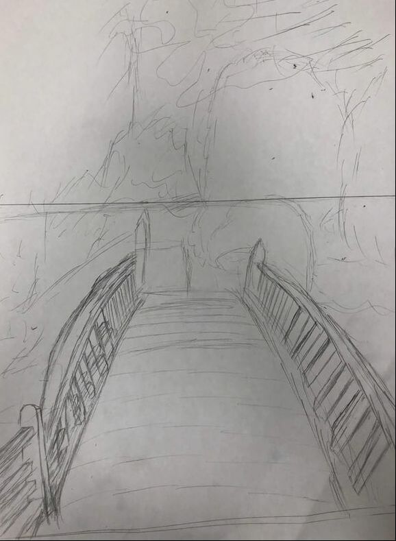 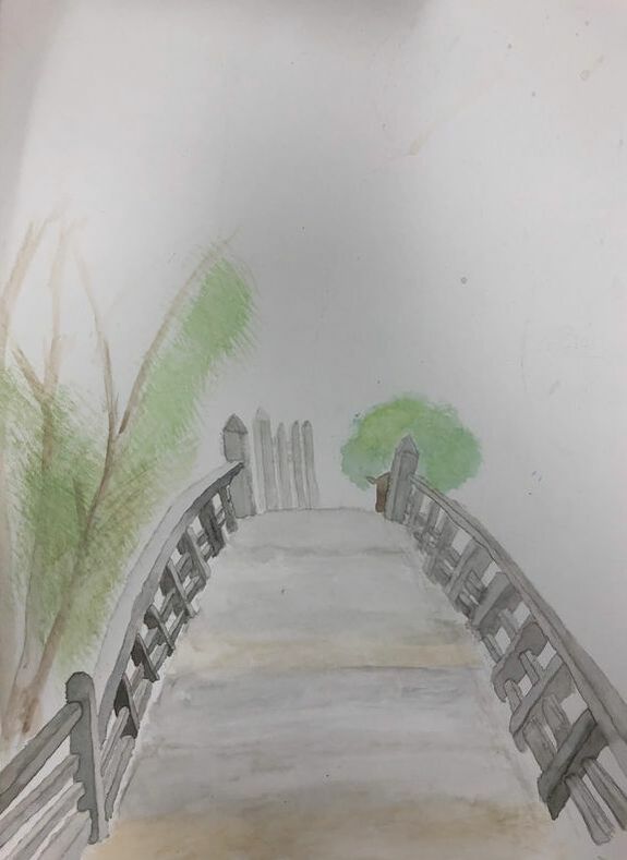 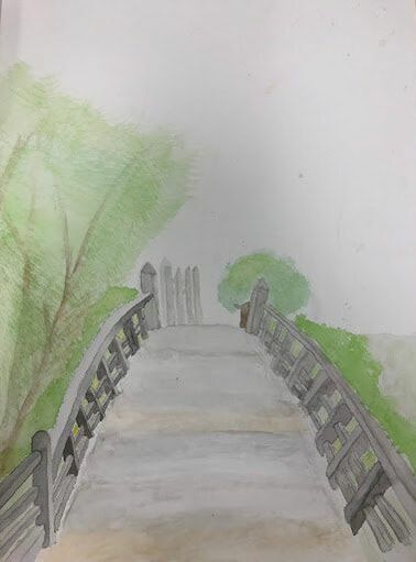 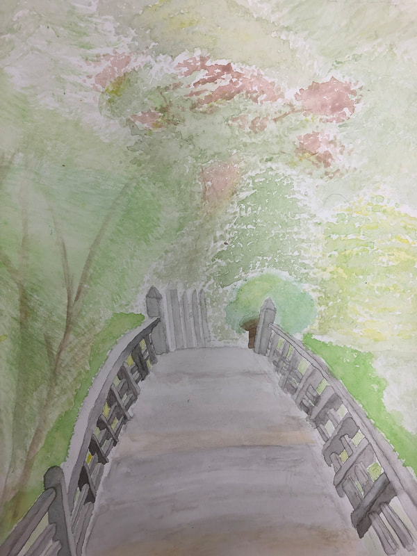  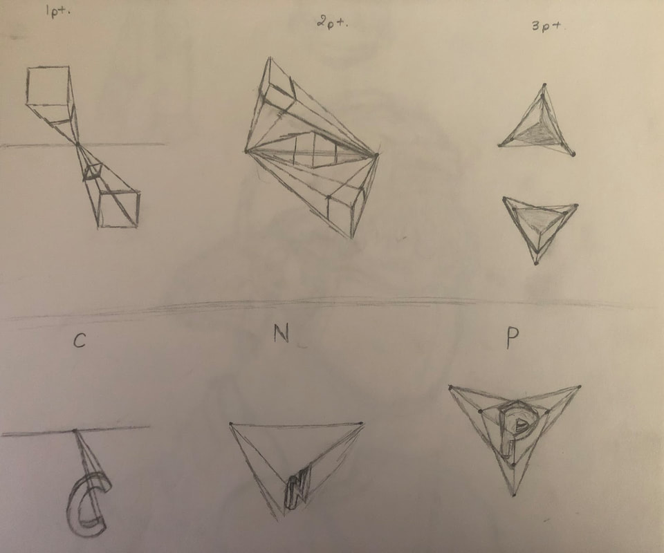 I used 1 point perspective with one vanishing point and one horizon line. I took the picture in a Japanese themed garden, called " Japanese Tea Garden", at Golden Gate Park located in San Francisco, California. It's the oldest public Japanese garden in the United States, and it featured a lot of Japanese culture, including Japanese architecture and plants. I enjoyed walking around and looking at the garden more than I thought, it was beautiful, peaceful and very unique and it represented Japan well. I found the bridge beautiful, it gave off a antique vibe, of something that was thought out well before built, it was very elegant, yet strong and detailed. It fitted in with it's surroundings and the theme, among the trees and the garden. The picture was the prettiest one In my gallery that showed perspective. Aspects that made the project hard was having to have to use water color in general for the painting is hard and also getting the perspective right was hard. In my painting, I had a bridge I had to paint with water color and the bridge had so many small details like the poles which were had to do. It was hard to do the shading on the poles. since I couldn't work on the same pole consecutively with the dark side and the light side. I usually did the dark side first than the lighter side, but since it was such a small are the water piled up and it and it took a long time to dry and whenever I tried painting the lighter side on, which had a lot more water in it since i had to use a lot to make my black lighter into a light gray, the dark and light side usually mixed with each other and it would make the dark side light and the light side darker and i would I have to dab the whole pole with a paper towel and start over. The water color paint was hard to control and it was hard to stay int he guide lines I had given my self and it was hard to make a gradient , using two colors, with the a paint. Also, it was hard for me to form my trees with the right texture, since I had to get the paint not too wet or it'll be blotchy or to dry or it'll look to stiff and dark. It was also hard when you made a mistake with a very dark color and you had wanted that place to have a lighter color, you couldn't paint over your mistake with the lighter color because the dark color would show through. It was also difficult to get the perspective right with the items in the painting having too get lighter and smaller as they get further away from you. Sometimes, as the pole got further away, I would accidentally make them bigger than they were suppose to be or darker than they were suppose to be because I had to dip my brush in paint again to get some pigment and those mistakes I couldn't really fix. I had the same problems with my trees, the ones that were suppose to be further back were suppose to be lighter but they were a very similar hue to the ones that were suppose to be closer. i also had a bit of trouble showing and following my horizon line and vanishing point. The illustration from a child's book watercolor warm up was helpful because it's a warm up that's very similar to our project. It let's us choose a watercolor illustration we wanted to paint and to paint the illustration we chose from book, which is similar to the project because we chose a picture, except the picture we chose were real and had to show perspective, and we had to base our painting off of it. We also had to first sketch out the illustration we chose from the book, just like what we had to do for project. Then, again similar to the project, we had to make/blend similar colors to the colors from the illustration with the water color and use and painting the colors in the right place. It gave us an idea of what the process of the project was going to be like and got us use it. It also allowed to actually do and use the techniques we learned in an actual picture and also gave us an idea of how well we did with water color on our own without a tutorial and instructions for us to follow, but with us using our own ideas. It allowed to get use to making the textures and blending different hues and shading in more complicated things and gave us an idea of how to incorporate different factors and styles and of what we should avoid doing or should do in our paintings later. The 3D letters were the most helpful to me because it was a nice introduction to all the different perspectives we could use for our paintings. It gave us an idea of how each one would look and how to use the different points and lines that are used for each perspective. It showed which ones were the most difficult to do it which ones were probably the easier ones and also which one we liked best and wanted to do. |
CatherineAspiring to do something. Archives
May 2019
Categories |
 RSS Feed
