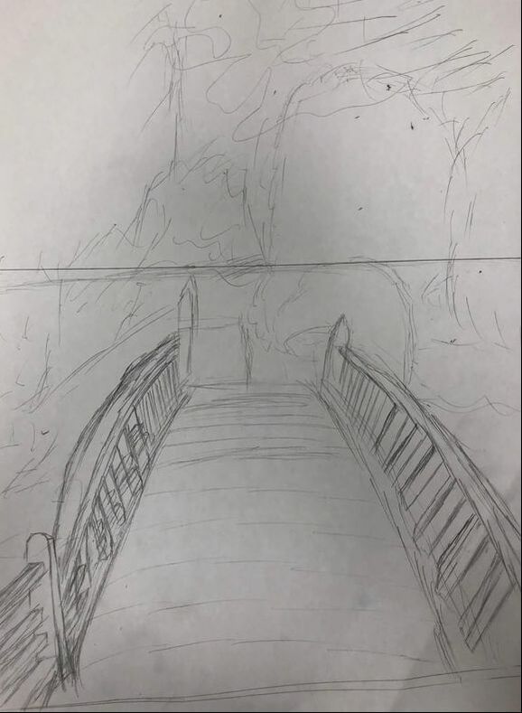
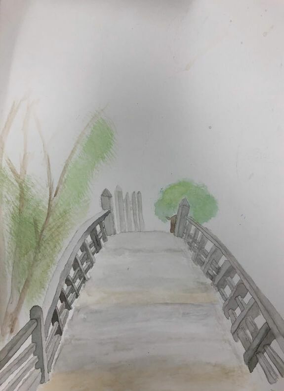
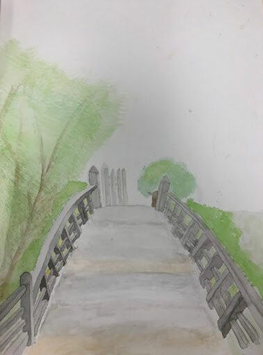
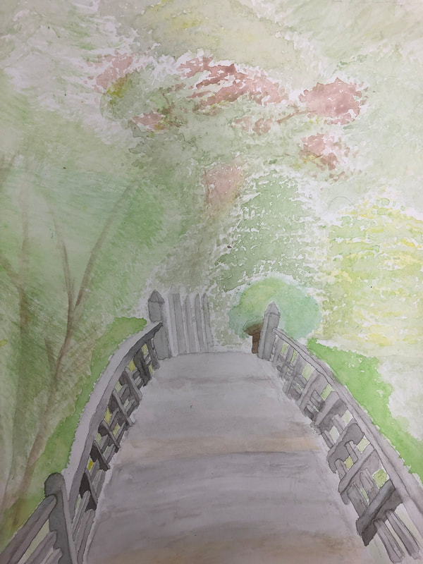
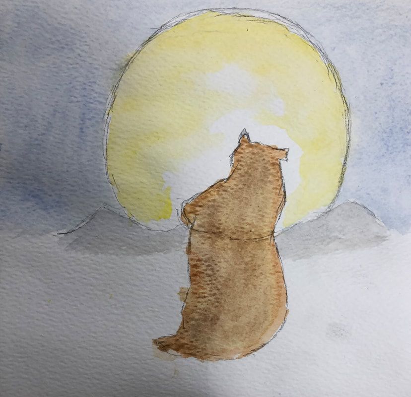
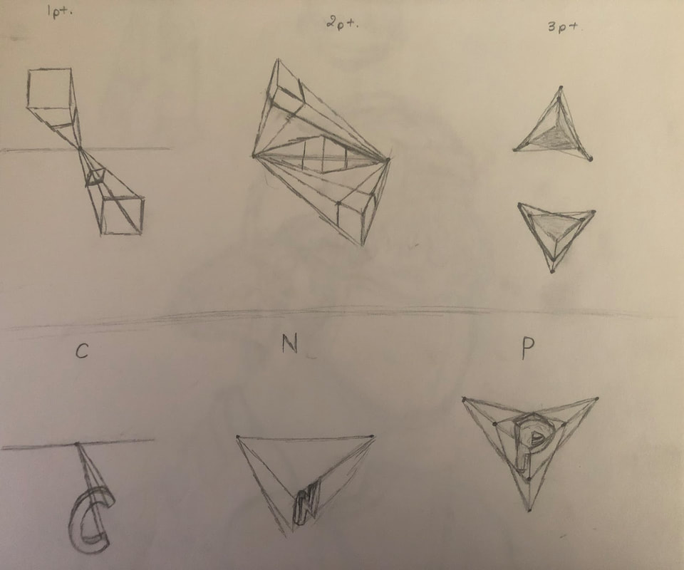
      I used 1 point perspective with one vanishing point and one horizon line. I took the picture in a Japanese themed garden, called " Japanese Tea Garden", at Golden Gate Park located in San Francisco, California. It's the oldest public Japanese garden in the United States, and it featured a lot of Japanese culture, including Japanese architecture and plants. I enjoyed walking around and looking at the garden more than I thought, it was beautiful, peaceful and very unique and it represented Japan well. I found the bridge beautiful, it gave off a antique vibe, of something that was thought out well before built, it was very elegant, yet strong and detailed. It fitted in with it's surroundings and the theme, among the trees and the garden. The picture was the prettiest one In my gallery that showed perspective. Aspects that made the project hard was having to have to use water color in general for the painting is hard and also getting the perspective right was hard. In my painting, I had a bridge I had to paint with water color and the bridge had so many small details like the poles which were had to do. It was hard to do the shading on the poles. since I couldn't work on the same pole consecutively with the dark side and the light side. I usually did the dark side first than the lighter side, but since it was such a small are the water piled up and it and it took a long time to dry and whenever I tried painting the lighter side on, which had a lot more water in it since i had to use a lot to make my black lighter into a light gray, the dark and light side usually mixed with each other and it would make the dark side light and the light side darker and i would I have to dab the whole pole with a paper towel and start over. The water color paint was hard to control and it was hard to stay int he guide lines I had given my self and it was hard to make a gradient , using two colors, with the a paint. Also, it was hard for me to form my trees with the right texture, since I had to get the paint not too wet or it'll be blotchy or to dry or it'll look to stiff and dark. It was also hard when you made a mistake with a very dark color and you had wanted that place to have a lighter color, you couldn't paint over your mistake with the lighter color because the dark color would show through. It was also difficult to get the perspective right with the items in the painting having too get lighter and smaller as they get further away from you. Sometimes, as the pole got further away, I would accidentally make them bigger than they were suppose to be or darker than they were suppose to be because I had to dip my brush in paint again to get some pigment and those mistakes I couldn't really fix. I had the same problems with my trees, the ones that were suppose to be further back were suppose to be lighter but they were a very similar hue to the ones that were suppose to be closer. i also had a bit of trouble showing and following my horizon line and vanishing point. The illustration from a child's book watercolor warm up was helpful because it's a warm up that's very similar to our project. It let's us choose a watercolor illustration we wanted to paint and to paint the illustration we chose from book, which is similar to the project because we chose a picture, except the picture we chose were real and had to show perspective, and we had to base our painting off of it. We also had to first sketch out the illustration we chose from the book, just like what we had to do for project. Then, again similar to the project, we had to make/blend similar colors to the colors from the illustration with the water color and use and painting the colors in the right place. It gave us an idea of what the process of the project was going to be like and got us use it. It also allowed to actually do and use the techniques we learned in an actual picture and also gave us an idea of how well we did with water color on our own without a tutorial and instructions for us to follow, but with us using our own ideas. It allowed to get use to making the textures and blending different hues and shading in more complicated things and gave us an idea of how to incorporate different factors and styles and of what we should avoid doing or should do in our paintings later. The 3D letters were the most helpful to me because it was a nice introduction to all the different perspectives we could use for our paintings. It gave us an idea of how each one would look and how to use the different points and lines that are used for each perspective. It showed which ones were the most difficult to do it which ones were probably the easier ones and also which one we liked best and wanted to do.
0 Comments
Leave a Reply. |
CatherineAspiring to do something. Archives
May 2019
Categories |
 RSS Feed
