|
WRITE - Explain the art criticism process 1. Describe the artwork. List what you see in the artwork. What images do you see? How you would describe it over the phone. Which art elements? Describe the color schemes. 2. Analyze the artwork. List art elements and design principles. Color, value, line, shape/form, texture, space. Balance, Emphasis, Harmony, Variety, Movement/ Rhythm, Proportion. 3. Interpret the artwork. Mood, feeling that is communicated, represented ideas, story that is being told 4. Judge the artwork. What do you think of the artwork? Is it successful? Why or why not? Support your opinion with evidence or criteria. (Art skills, meaning, creative, realistic) 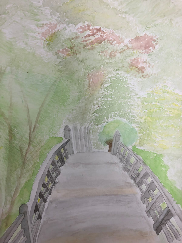 CRITIQUE an older piece of your work USING THE PROCESS FROM #1 You are going to evaluate your piece using art vocabulary and in-depth discussion of your piece, what it means, what you learned, etc. 1. The artwork is made using watercolor and there is a bridge with a railing in the center of the painting and a variety trees, bushes and other plants in the background and the painting is in 1 point perspective. The trees are all of different types/species, with different leaf shapes and trunk structures and the trees all have many different shades and tints of green and some plants also have other colors besides just green, some have yellow some have browns and more and all the trees are grouped together to form a forest behind the bridge. The bridge is mostly made out of rectangular poles in the railing and planks and the bridge has some wooden planks that is losing its grayish color and now is fading into a orange color and some of the other wood is a little green due to mold and moss. The poles of the railing has a lot of shadows and lights among them. The painting has a cold colors and earthy and natural color theme, possessing a lots of colors that you would commonly find outside in nature, having many shades and tints of greens, brown, gray and yellow. 2. There is emphasis on the bridge in the center, and the fence connected to it at the end of the other side, since the bridge and fence consist of darker colors, which contrast to the brighter colors of the trees in the background and also since there is only one of them and it's their the only man made things in the painting. The art work is in 1 point perspective, with the one vanishing point at the tip of the highest, left pole belonging to the fence on the other side and the orthogonal lines kind of follow the direction of the railing on both sides of the bridge and the one horizon line goes through the point. There is a lot of value on the bridge, especially on all the poles on the railing; there are a lot of shadows and lights represented. The space in some of the trees and between the trees adds a sense of depth. The different shades and tints and varying colors in the bridge and the plants makes them look more 3D or possess more depth and realistic; on the trees it kind of shows the leaves density and leaves or patches of leaves covering and casting shadows over each other and on the bridge it shows which parts of the railings are covered and have shadows cast over them and the parts that are lighter and having light shined on them. The closer the trees are the darker in color they are and the clearer and more detailed they are and the further away they are, the lighter they are and more blurred and less detailed they are. There are many different varieties of trees and for some trees, the shape of the leaves and the amount of leaves on the tree allow you to see the trunk and branch structure underneath but some trees, with the shape of their leaves and dense amount of leaves, it's harder to see the trunk and branch structure underneath but you can make out a vague guess of the structure with the overall/outline shape of the leaves. The tree structures are varying but they usually have a thicker base or trunk and the bottom half of the trees have thicker and bigger branches and as you head more towards the top of the trees, the branch become thinner and smaller; all this though varies according to the type of plants shown, like for the tree to the far left bottom corner, it has multiple thin trunks that gradually become thinner and has thinner branches but for a different plant like a bush, the trunk might stay more consistent or become thinner faster as to head up the plant and the branches could be smaller and thinner, since a bush is much shorter and for the tree more in the back, it has one big trunk that has big branches that naturally become thinner as you go higher; so there are many structures plants can possess and plants can vary in many heights and no two trees or plants are the same. The trees have varying density in different areas of the trees, so in a tree you can sometimes see the branches where the leaves are thinner, the transparency of water color really helps with this, if you want more transparency to show branches through the leaves when adding leaves, add more water and if the color for the leaves are light, then darker colors for branches can be added over. The water color used gives the art work more of a fluid and kind of a abstract look and the combination of the fluid watercolor appearance and the the use of a fan brush, allowed the creation of very realistic shapes and textures of various types of trees, allowing the trees to actually look that they have leaves on them (textures and shapes vary according to structures and leaf shape of trees). The transparency of the water color allows and shows on a smooth fade of the wood going from grayish to more of an orange color. 3. The mood of the painting is refreshing, tranquil, lighthearted and bright. The theme of the painting was perspective. It gives off or expresses a relaxing feeling of enjoying a peaceful scenery of the nature and the architecture of the bridge, not something extravagant but something simple and elegant and also being filled with a sense of happiness of appreciating the beauty of the details of your surroundings and the outdoors. It gives off ideas that even the simplest things have a lot of details if you look close enough and that the outside world always has a lot of beauty and a variety things for your to look at, appreciate and enjoy, even if you are just by yourself. It conveys a story or experience of taking a walk or having a casual stroll or walking around and sightseeing in a park or garden; enjoying the bright clear weather and just enjoying the day in general and to just have the desire or urge to go outside and to look at the different things in the world outside and to enjoy nature and the different structures and all the colors and culture. To just go somewhere peaceful to get away from the hustle and bustle of society and people and to let yourself go and to just enjoy having time to yourself. 4. I think overall the artwork was successful. It displayed and showcased the theme of perspective well, with the piece possessing a clear 1 point perspective. This was my first time working with watercolor and overall the skills and techniques I used and executed in the painting turned out really well, like the layering, the wash and dry brush. I was able to overcome the kind of unforgiving part of watercolor, since if you make a mistake with the colors you can't really paint over it and cover it, especially if the mistake is made with a dark color. I was also able to overcome the characteristic of watercolor kind of being hard to control and seeping into and bleeding into places it's not supposed to and not staying in guidelines; to complete the scene and painting that I wanted. People looking at the painting can easily recognize what's being portrayed in the painting, a scene outside with a bridge and a forest filled with a variety of trees in the background or on the other side of the bridge. It's a really similar to the picture that I was referencing off of and using it to paint the painting( the picture that I took in a garden where the bridge and trees were). I was also able to really make the bridge, the structure and aspect that I wanted people to focus on, stand out with it's dark colors in contrast to the bright colors of the trees. For bridge I was able to apply a lot of the value and the depth of the actual bridge, especially in the poles where most of the value is, portraying the parts that were cast in shadows and the part that were lighter with light hitting and shining on them. I also portrayed the many values in the many trees, with all of the shadows/dark and lights. I was also able to get the correct/realistic textures and shapes for all of the different types of trees and other plants and the leaves weren't just different shades and tints of green but they all had other natural colors in them two like yellows and reds and browns, and they all varied in shapes, structures and leaf shape which made them more realistic. The painting has a nice abstract and realistic look to it and I was able to complete the difficult little details (like the poles and trying to make them kind similar and uniformed) with watercolor, and also the gradients, the smooth transitions from one color to another. I was also able to portray and capture the vibe and feeling of the aspects in my painting, like the variety of the trees and the elegance and many details of the bridge. The picture has a lot of meaning to me, kind of a vibe and meaning of beauty, tranquility, simplicity and kind of the feeling of just having time to myself and being able to get away from the usual noise and sights of society and I was able to capture and portray that in my painting/art work of the picture so that other can kind of see and feel the meaning I feel towards it and kind of in a way seeing through my eyes.
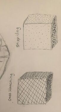
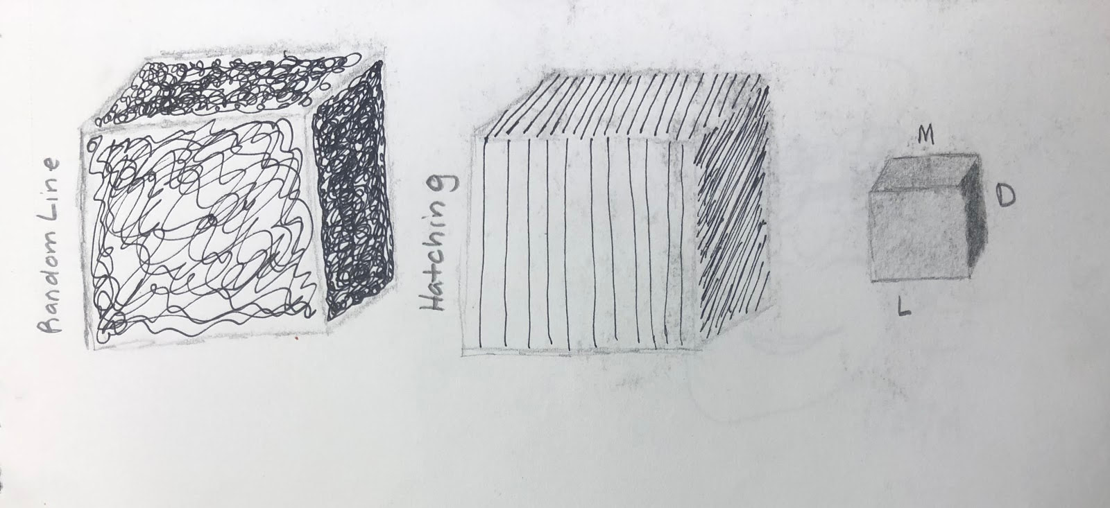
8. What was the warm up or sketchbook assignment that you learned the most from? The warm up I learned the most from was the pen cubes we did near the beginning of the semester for our drawing unit. The pen cubes warm up refreshed my memory on the steps on how to quickly draw a realistic and proper 3D, which at the time I had forgotten how and was wanting to remember how. The pen cubes also taught me how to correctly add value to a cube ; I learned about the lighting of the cube and the different shades for different sides of the cube. The front side of the cube is the lightest, the right side is the darkest and the top side is medium or a shade that is in between the lightest and the darkest sides. The pen cubes introduced me to a medium I've never really used a lot of, pen. Pen was something I've never used to draw a full piece before, since I thought you couldn't really or just didn't know how to add detail, textures, shading and value with a pen, since you can't really make pen light or dark, it stays a consistent shade and really have only used it for things like outlining. But the warm up introduced me to four new techniques, (cross hatching, stippling, random line and hatching) that could allow me to add all of those things, especially shading and value, it showed that with pen, which I thought I could only do simple things with, could also be used to make pretty detailed and intricate things, and i learned how to do that through the techniques introduced. The main take away I got from the warm up was how to make, using pen and the techniques, different parts lighter or darker, for example, for stippling, you add more dots to make a part darker and for hatching, you add more lines to make a part darker. The warm up deepen my understanding of how to apply value to a piece of artwork, and also concepts of light and dark. I learned more about the relationship and connection between the light source and shadows, like where some parts should be darker or lighter or a bit more medium depending on where the light source is and the difference of darks and light depending on if the light source is angled or direct; for example how the, due to the position of the light source, the right side of the cube is the darkest compared to other sides since the position of the lightsource cause a shadow to be casted over that side and for no light to reach that side. 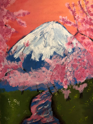 16. Do over: If given the opportunity, which project would you do over? Describe why and how you would redo this project. Reasons might include choosing a different theme, using a different medium or creating a different idea completely. Include photo. I would like to do over this project because my painting, using acrylic, looks a little bit incomplete for me, it needs more detail and the picture or reference I chose to paint I feel like was too complicated for me to do for my first time using acrylic painting. The cherry blossom trees are a weird shape and the shade and tints of pink that I used don't really look well together or go together to look like cherry blossoms and don't form the form and shape of the multiple/group or rows of cherry blossom trees in front of a mountain I wanted or envisioned. The cherry blossoms I painted on the trees only look like they are tightly clumped together and sticking onto the branches and there are so many revealing branches and the cherry blossom trees don't have that kind of "full" and natural look that they should have, they look stick-like and oddly shaped and some look just like random floating branches or trees with branches that don't belong to them. The trees have flowers in odd places, like some of flowers are too low, and there are a lot of weird holes in the flowers and the flowers don't really have the correct texture, it looks to splotchy, clumpy and some parts look weirdly smeared and not realistic at all. I also didn't achieve the perspective I wanted with the cherry blossoms, the darker colored cherry blossoms were ones that were supposed to be closer and the ones that were lighter were supposed to be more down the river or further away and closer to the mountain, but it just looks like all of them are in just in one row close to the viewer. There is not enough shading in the trees, especially, in the mountain, to give it the proper realistic appearance and a rough and rocky texture and on top of that it's a bit weirdly shaped. Also the reflection of the cherry blossoms in the river does not look realistic, it just looks like a river with rushing blue and pink water. So how I would probably fix my painting would be first to choose another landscape reference picture, probably a more simpler one, to represent my "idea of place" (the theme), to represent Japan, since I am still keeping the theme. Though I would like to keep the cherry blossoms, river and the mountain in the background. This time though, I will be putting some or all of the trunk in the picture, since the branches I painted to kind of look like they are reaching in the photo or are too long for the trunk to be in the picture, look like floating sticks. I will also might use a thinner brush and more technique to give the branches and trunks of the trees a more realistic and natural look and structure and will be looking at references of trees closely. Also, I'll be adding more texture to the wood that is revealed through the flowers and also to make the branches less seen and noticeable through the flowers, only some of the branches can be seen ( less of the branches can be seen compared to the original). I will also use a fan brush this time to create the right texture and achieve the "full" shape and natural look of cherry blossom trees and will also study and look at the reference picture more often so that I don't place flowers in odd places and places where they aren't supposed to be. For the reflection of the water, I will only be adding pink or kind of a rushed and blurred reflection in places where there is actually a tree present above the water, and the reflection will look similar to a shape of a tree; of course the reflection in the water will be blurred and sort of pulled in the direction the river is flowing in. For the colors of the cherry blossoms, I will used more darker colors for the ones that appear closer and won't use the same tint of pink color for both the trees and that are closer and for those that are further. I will use two shades of pink or one shade and a dark tint of pink for the ones that are closer, so that the colors for the trees that are closer don't harshly contrast and look unnatural with each other and for the trees that are further away and further down the river, I will use two different tints of pink, this will create more of a clear and realistic perspective. For the mountain I will make the shape a bit less wide and smooth and rounded and instead more peaked and taller. I will also use probably a different blue for the mountain, possibly a blue with that is lighter and a more variety of different tints and shades of blues to create the lights and darks, the realistic value, in the mountain and use both a tint of blue and light gray to create the shadows in the snow, then I can create the correcte rough and jagged texture and appearance of a mountain. For the grass, I will make the gradient of colors of green more smoother and add more shading in the grass and make the two side look more bumby and rough instead of smooth.
18. Medium: which medium did you most enjoy working with and why? Which medium did you not use but wish you had explored? Include photo.
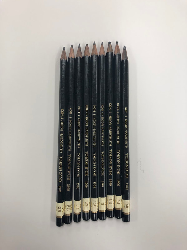
The medium that I most enjoyed was pencil. A pencil is very versatile and flexible medium and you can create so many different thing with it. Pencils are very adaptable and useful for many different techniques; it's really easy the blend, smudge, shade with ( offering a wide range fo ow dark you can make the be, weather it be do to which type of pencil you use or how hard ou press), do clean line work with, do hatching with and its able to be used for so many more other techniques. Also, it nice that pencils can be used on most surfaces. It's also really easy and effective to use add value to an artwork using pencil, since it can be both light and dark, depending on which type of pencil you use and how hard you press and it has a wide range of of different pencils that vary n lightness and darkness. I like and enjoyed how there are kind of different "versions of pencils"available, since pencil has a variety of lead with different ranges of how dark and light and also a range of how dark and soft they can be, like 8B is really soft and dark and 2H is really light and hard. Also, since I make a lot of mistakes, I enjoy how pencil is a very forgiving medium and if you make any mistakes you can easily get rid of them by erasing them, no matter how big or small your mistake is, using an eraser and then I can just fix my mistake. Also with pencils, by being able to have a small, sharp tip or a flat tip on a pencil, you can easily create a variety of small and fine details and also a variety of different textures. Pastel was a medium I didn't use in any of my artwork but would've liked to explore. The different types of pastels are soft, PanPastel, hard, pencil, and oil, but the three major types are soft hard and oil, which are the ones I want to explore, and all of them are unique in their own way. Pastels are pigmented in color and produce brilliant and intense colors and the surface you use them on can have a dramatic effect on the outcome. You don't need much to used them, just your fingers and they are versatile and you can achieve many different effects and techniques with the. Pastels blend really well and since they don't mix very well, they usually come in a huge range of different colors. Soft and oil pastels are more suited for painterly effects and hard pastels are suited for drawing, sketching and precision. Soft pastels have a high concentration of color and produce very intense colors.Their fragile consistency and powdery texture makes them well suited to blending, layering on lots of color, and for painterly effects. You can also use the edges for fine lines. Hard pastels contain more binder and less pigment. They're more stable, hard pastels are especially suited to drawing techniques and working on location. Oil pastels won't crumble or smudge like soft pastels, but they still contain just as much, if not more, pigment and produce bright, intense colors. Oil pastels are more stable than soft pastels and don't require a fixative. This makes them great for using on location.They can be spread like oil paint on the support to create strong, buttery strokes. Using oil pastels can be as simple as applying pigment to a sheet of paper with your bare hands. But their versatility allows so much more. You can create impasto effects or thin them with turpentine to create glazes or washes.
0 Comments
Leave a Reply. |
CatherineAspiring to do something. Archives
May 2019
Categories |
 RSS Feed
